1.结构伪类选择器
**作用与优势: **
- 作用:根据元素在HTML中的结构关系查找元素
- 优势:减少对于HTML中类的依赖,有利于保持代码整洁
- 场景:常用于查找某父级选择器中的子元素
选择器:
| 选择器 |
说明 |
| E:first-child {} |
匹配父元素中第一个子元素,并且是E元素 |
| E:last-child {} |
匹配父元素中最后一个子元素,并且是E元素 |
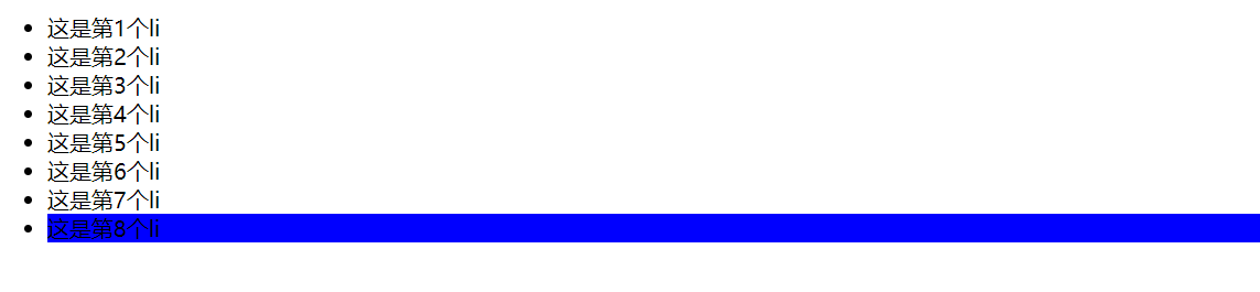
| E:nth-child {} |
匹配父元素中第n个子元素,并且是E元素 |
| E:nth-last-child(n) {} |
匹配父元素中倒数第n个子元素,并且是E元素 |
案例:
1
2
3
4
5
6
7
8
9
10
11
12
13
14
15
16
17
18
19
20
21
22
23
24
25
26
27
28
29
30
31
32
33
34
35
36
37
38
39
40
41
42
43
44
| <!DOCTYPE html>
<html lang="en">
<head>
<meta charset="UTF-8">
<meta http-equiv="X-UA-Compatible" content="IE=edge">
<meta name="viewport" content="width=device-width, initial-scale=1.0">
<title>Document</title>
<style>
li:nth-last-child(1) {
background-color: blue;
}
</style>
</head>
<body>
<ul>
<li>这是第1个li</li>
<li>这是第2个li</li>
<li>这是第3个li</li>
<li>这是第4个li</li>
<li>这是第5个li</li>
<li>这是第6个li</li>
<li>这是第7个li</li>
<li>这是第8个li</li>
</ul>
</body>
</html>
|

n的注意点:
- n为:0、1、2、3、4、5、6、……
- 通过n可以组成常见公式
| 功能 |
公式 |
| 偶数 |
2n、even |
| 奇数 |
2n+1、2n-1、odd |
| 找到前5个 |
-n+5 |
| 找到从第5个往后 |
n+5 |
案例:
1
2
3
4
5
6
7
8
9
10
11
12
13
14
15
16
17
18
19
20
21
22
23
24
25
26
27
28
29
30
31
32
33
34
35
| <!DOCTYPE html>
<html lang="en">
<head>
<meta charset="UTF-8">
<meta http-equiv="X-UA-Compatible" content="IE=edge">
<meta name="viewport" content="width=device-width, initial-scale=1.0">
<title>Document</title>
<style>
li:nth-child(4n) {
background-color: green;
}
</style>
</head>
<body>
<ul>
<li>这是第1个li</li>
<li>这是第2个li</li>
<li>这是第3个li</li>
<li>这是第4个li</li>
<li>这是第5个li</li>
<li>这是第6个li</li>
<li>这是第7个li</li>
<li>这是第8个li</li>
</ul>
</body>
</html>
|
1
2
3
4
5
6
7
8
9
10
11
12
13
14
15
16
17
18
19
20
21
22
23
24
25
26
27
28
29
30
31
32
33
34
35
36
37
38
39
40
41
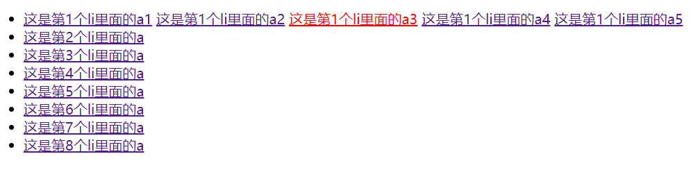
| <!DOCTYPE html>
<html lang="en">
<head>
<meta charset="UTF-8">
<meta http-equiv="X-UA-Compatible" content="IE=edge">
<meta name="viewport" content="width=device-width, initial-scale=1.0">
<title>Document</title>
<style>
li:first-child a:nth-child(3) {
color: red;
}
</style>
</head>
<body>
<ul>
<li>
<a href="#">这是第1个li里面的a1</a>
<a href="#">这是第1个li里面的a2</a>
<a href="#">这是第1个li里面的a3</a>
<a href="#">这是第1个li里面的a4</a>
<a href="#">这是第1个li里面的a5</a>
</li>
<li><a href="#">这是第2个li里面的a</a></li>
<li><a href="#">这是第3个li里面的a</a></li>
<li><a href="#">这是第4个li里面的a</a></li>
<li><a href="#">这是第5个li里面的a</a></li>
<li><a href="#">这是第6个li里面的a</a></li>
<li><a href="#">这是第7个li里面的a</a></li>
<li><a href="#">这是第8个li里面的a</a></li>
</ul>
</body>
</html>
|
2.伪元素
伪元素:一般页面中的非主体内容可以使用伪元素
区别:
- 元素:HTML 设置的标签
- 伪元素:由 CSS 模拟出的标签效果
种类:
| 伪元素 |
作用 |
| ::before |
在父元素内容的最前面添加一个伪元素 |
| ::after |
在父元素内容的最后添加一个伪元素 |
- 注意点:
- 必须设置content属性才能生效
- 伪元素默认是行内元素
案例:
1
2
3
4
5
6
7
8
9
10
11
12
13
14
15
16
17
18
19
20
21
22
23
24
25
26
27
28
29
30
31
32
33
34
35
36
37
38
39
40
41
42
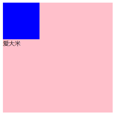
| <!DOCTYPE html>
<html lang="en">
<head>
<meta charset="UTF-8">
<meta http-equiv="X-UA-Compatible" content="IE=edge">
<meta name="viewport" content="width=device-width, initial-scale=1.0">
<title>Document</title>
<style>
.father {
width: 300px;
height: 300px;
background-color: pink;
}
.father::before {
content: '';
color: green;
width: 100px;
height: 100px;
background-color: blue;
display: block;
}
.father::after {
content: '大米';
}
</style>
</head>
<body>
<div class="father">爱</div>
</body>
</html>
|
**小结 **:
伪元素的必加属性是?
伪元素创建出来后默认的显示模式是?
4.浮动
4.1 传统网页布局的三种方式
网页布局的本质:用 CSS 来摆放盒子,把盒子摆放到相应位置。
CSS 提供了三种传统布局方式(简单说就是盒子如何进行排列)。
这里指的只是传统布局,其实还有一些特殊高级的布局方式。
4.2 标准流(普通流/文档流)
所谓的标准流:就是标签按照规定好的默认方式排列。
- 块级元素会独占一行,从上向下顺序排列。
- 行内元素会按照顺序,从左到右顺序排列,碰到父元素边缘则自动换行。
以上都是标准流布局,我们前面学习的就是标准流,标准流是最基本的布局方式。
这三种布局方式都是用来摆放盒子的,盒子摆放到合适位置,布局自然就完成了。
注意:实际开发中,一个页面基本都包含了这三种布局方式(后面移动端学习新的布局方式) 。
4.3 浮动的作用
早期的作用:图文环绕
现在的作用:网页布局
- 场景:让垂直布局的盒子变成水平布局,如:一个在左,一个在右
4.4 为什么要用浮动
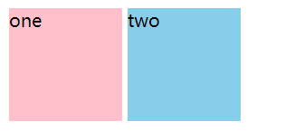
现在来思考这个问题,我们想让多个div标签(块级元素),并排排列(即变成水平布局),该怎么做呢?首先我们想到的是利用display: inline-block;将div标签转化为行内块标签,这时我们看看效果,如下所示:
1
2
3
4
5
6
7
8
9
10
11
12
13
14
15
16
17
18
19
20
21
22
23
24
25
26
27
28
29
| <!DOCTYPE html>
<html lang="en">
<head>
<meta charset="UTF-8">
<meta http-equiv="X-UA-Compatible" content="IE=edge">
<meta name="viewport" content="width=device-width, initial-scale=1.0">
<title>Document</title>
<style>
div {
display: inline-block;
width: 100px;
height: 100px;
}
.one {
background-color: pink;
}
.two {
background-color: skyblue;
}
</style>
</head>
<body>
<div class="one">one</div>
<div class="two">two</div>
</body>
</html>
|
如上所示,可以看到这两个div标签之间有很大的空隙,那么我们如何才能消除这个空隙呢?如果不引入浮动机制的话,只能用下面这种方法:即让两个div标签并排书写,不能换行。
1
| <div class="one">one</div><div class="two">two</div>
|
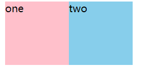
可以看到,这样写是非常糟糕的,可读性非常差,那么有没有更好的方式呢,因此我们引入浮动机制,如下所示,我们进行改进:
1
2
3
4
5
6
7
8
9
10
11
12
13
14
15
16
17
18
19
20
21
22
23
24
25
26
27
28
29
30
31
32
33
34
35
36
| <!DOCTYPE html>
<html lang="en">
<head>
<meta charset="UTF-8">
<meta http-equiv="X-UA-Compatible" content="IE=edge">
<meta name="viewport" content="width=device-width, initial-scale=1.0">
<title>Document</title>
<style>
div {
width: 100px;
height: 100px;
}
.one {
background-color: pink;
float: left;
}
.two {
background-color: skyblue;
float: left;
}
</style>
</head>
<body>
<div class="one">one</div>
<div class="two">two</div>
</body>
</html>
|
4.4 浮动的代码
float 属性用于创建浮动框,将其移动到一边,直到左边缘或右边缘触及包含块或另一个浮动框的边缘。
语法:
| 属性 |
描述 |
| none |
元素不浮动(默认值) |
| left |
元素向左浮动 |
| right |
元素向右浮动 |
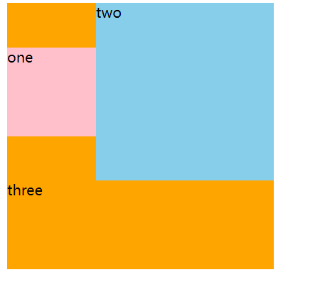
4.5 浮动的特点
浮动元素会脱离标准流(简称:脱标),在标准流中不占位置
浮动元素比标准流高半个级别,可以覆盖标准流中的元素
浮动找浮动,下一个浮动元素会在上一个浮动元素后面左右浮动
浮动元素有特殊的显示效果
注意点:
- 浮动的元素不能通过
text-align:center或者margin:0 auto
1
2
3
4
5
6
7
8
9
10
11
12
13
14
15
16
17
18
19
20
21
22
23
24
25
26
27
28
29
30
31
32
33
34
35
36
37
38
39
40
41
42
43
44
| <!DOCTYPE html>
<html lang="en">
<head>
<meta charset="UTF-8">
<meta http-equiv="X-UA-Compatible" content="IE=edge">
<meta name="viewport" content="width=device-width, initial-scale=1.0">
<title>Document</title>
<style>
.one {
width: 100px;
height: 100px;
background-color: pink;
float: left;
margin-top: 50px;
}
.two {
width: 200px;
height: 200px;
background-color: skyblue;
float: left;
margin: 0 auto;
}
.three {
width: 300px;
height: 300px;
background-color: orange;
}
</style>
</head>
<body>
<div class="one">one</div>
<div class="two">two</div>
<div class="three">three</div>
</body>
</html>
|
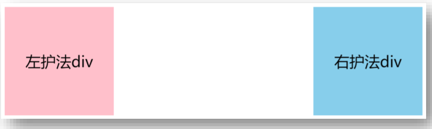
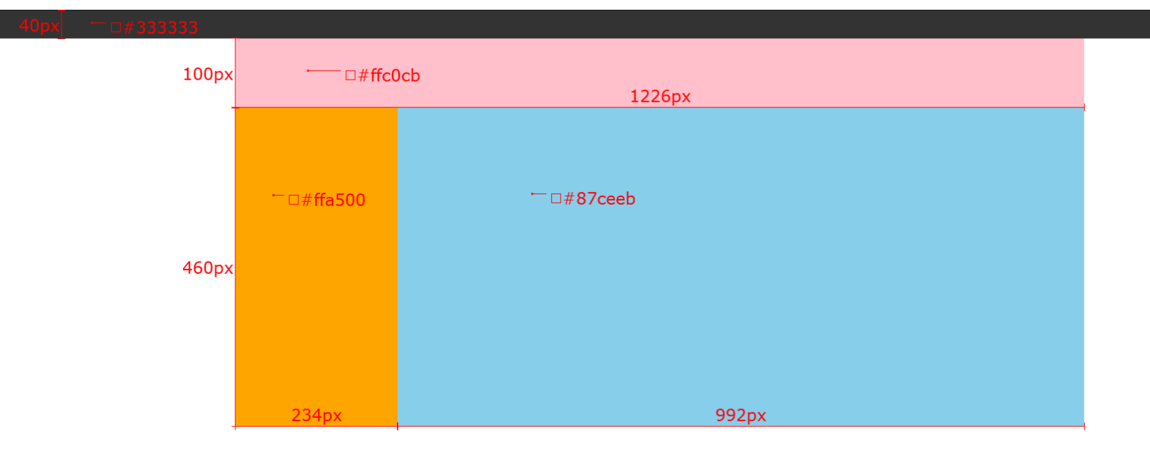
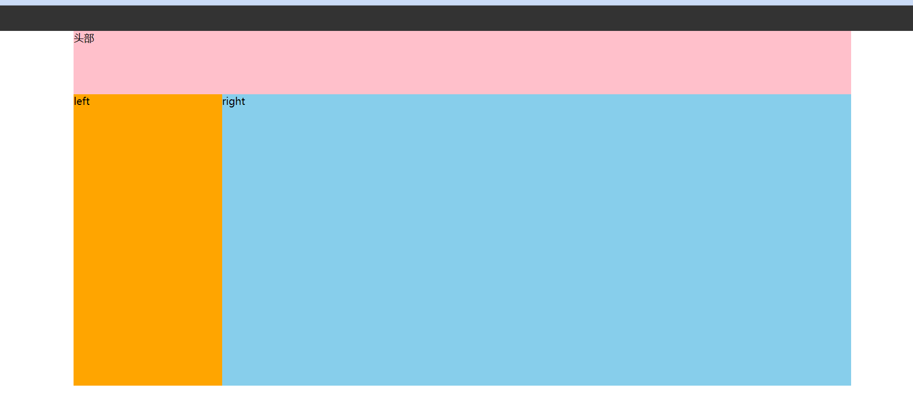
4.6 (案例)网页布局案例
需求:使用浮动,完成设计图中布局效果
1
2
3
4
5
6
7
8
9
10
11
12
13
14
15
16
17
18
19
20
21
22
23
24
25
26
27
28
29
30
31
32
33
34
35
36
37
38
39
40
41
42
43
44
45
46
47
48
49
50
51
52
53
54
55
56
57
58
59
60
61
62
63
64
65
66
67
68
69
70
| <!DOCTYPE html>
<html lang="en">
<head>
<meta charset="UTF-8">
<meta http-equiv="X-UA-Compatible" content="IE=edge">
<meta name="viewport" content="width=device-width, initial-scale=1.0">
<title>Document</title>
<style>
* {
margin: 0;
padding: 0;
}
.top {
height: 40px;
background-color: #333;
}
.header {
width: 1226px;
height: 100px;
background-color: #ffc0cb;
margin: 0 auto;
}
.content {
width: 1226px;
height: 460px;
background-color: green;
margin: 0 auto;
}
.left {
float: left;
width: 234px;
height: 460px;
background-color: #ffa500;
}
.right {
float: left;
width: 992px;
height: 460px;
background-color: #87ceeb;
}
</style>
</head>
<body>
<div class="top"></div>
<div class="header">头部</div>
<div class="content">
<div class="left">left</div>
<div class="right">right</div>
</div>
</body>
</html>
|
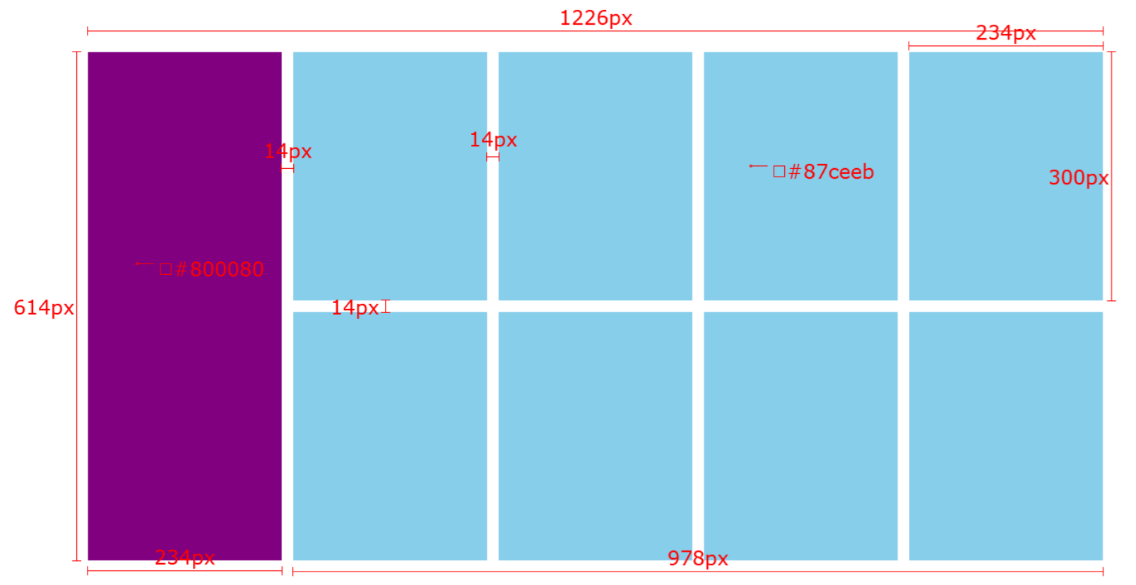
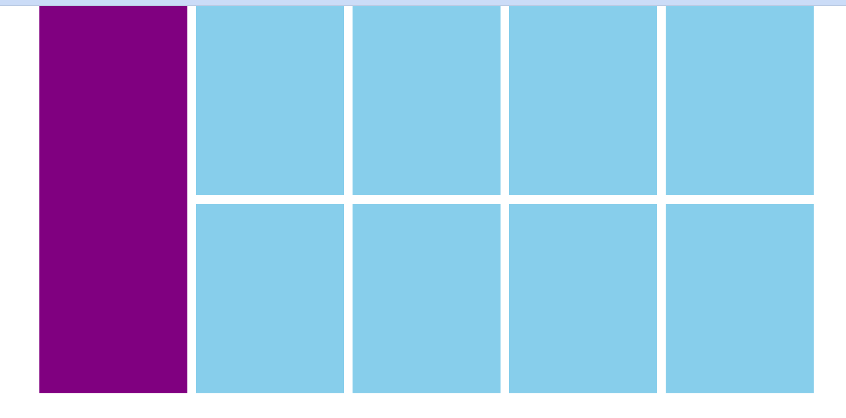
4.7 (案例)小米模块案例
需求:使用浮动,完成设计图中布局效果
1
2
3
4
5
6
7
8
9
10
11
12
13
14
15
16
17
18
19
20
21
22
23
24
25
26
27
28
29
30
31
32
33
34
35
36
37
38
39
40
41
42
43
44
45
46
47
48
49
50
51
52
53
54
55
56
57
58
59
60
61
62
63
64
65
66
67
68
69
70
71
72
73
74
75
76
77
78
79
| <!DOCTYPE html>
<html lang="en">
<head>
<meta charset="UTF-8">
<meta http-equiv="X-UA-Compatible" content="IE=edge">
<meta name="viewport" content="width=device-width, initial-scale=1.0">
<title>Document</title>
<style>
* {
margin: 0;
padding: 0;
}
.box {
margin: 0 auto;
width: 1226px;
height: 614px;
}
.left {
float: left;
width: 234px;
height: 614px;
background-color: #800080;
}
.right {
float: right;
width: 978px;
height: 614px;
}
ul {
list-style: none;
}
.right li {
float: left;
margin-right: 14px;
margin-bottom: 14px;
width: 234px;
height: 300px;
background-color: #87ceeb;
}
.right li:nth-child(4n) {
margin-right: 0;
}
</style>
</head>
<body>
<div class="box">
<div class="left"></div>
<div class="right">
<ul>
<li></li>
<li></li>
<li></li>
<li></li>
<li></li>
<li></li>
<li></li>
<li></li>
</ul>
</div>
</div>
</body>
</html>
|
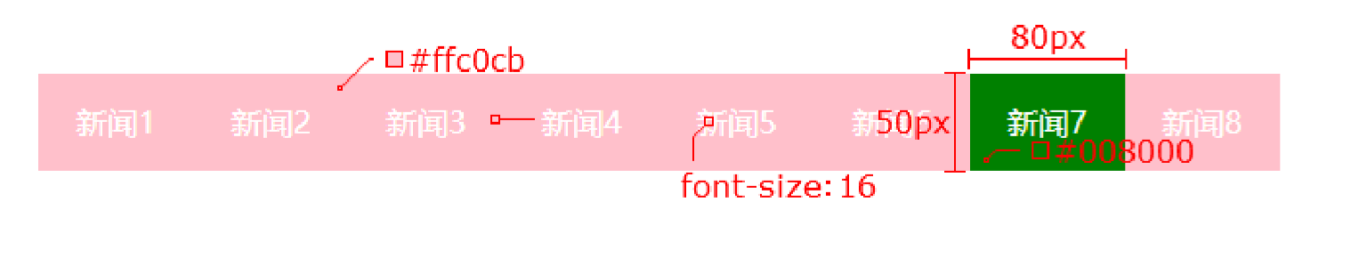
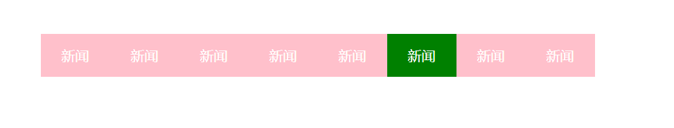
4.8 (案例)网页导航案例
需求:使用浮动,完成设计图中布局效果
1
2
3
4
5
6
7
8
9
10
11
12
13
14
15
16
17
18
19
20
21
22
23
24
25
26
27
28
29
30
31
32
33
34
35
36
37
38
39
40
41
42
43
44
45
46
47
48
49
50
51
52
53
54
55
56
57
58
59
60
61
62
63
64
65
66
| <!DOCTYPE html>
<html lang="en">
<head>
<meta charset="UTF-8">
<meta http-equiv="X-UA-Compatible" content="IE=edge">
<meta name="viewport" content="width=device-width, initial-scale=1.0">
<title>Document</title>
<style>
* {
margin: 0;
padding: 0;
}
.nav {
margin: 50px auto;
width: 640px;
height: 50px;
background-color: #ffc0cb;
}
ul {
list-style: none;
}
.nav li {
float: left;
}
.nav li a {
display: block;
width: 80px;
height: 50px;
text-align: center;
line-height: 50px;
color: #fff;
text-decoration: none;
}
.nav li a:hover {
background-color: green;
}
</style>
</head>
<body>
<div class="nav">
<ul>
<li><a href="#">新闻</a></li>
<li><a href="#">新闻</a></li>
<li><a href="#">新闻</a></li>
<li><a href="#">新闻</a></li>
<li><a href="#">新闻</a></li>
<li><a href="#">新闻</a></li>
<li><a href="#">新闻</a></li>
<li><a href="#">新闻</a></li>
</ul>
</div>
</body>
</html>
|
5.清除浮动
5.1 思考题
我们前面浮动元素有一个标准流的父元素,他们有一个共同的特点,都是有高度的。
但是,所有的父盒子都必须有高度吗?
答案:不一定!比如,一个产品列表,随着时期的不同,产品数量也不同,所需的盒子大小也会随之改变,那么直接固定盒子高度的形式显然就是不行的。再比如,文章之类的盒子,不同的文章字数是不相同的,那么显然盒子也不能直接固定高度。
理想中的状态,让子盒子撑开父亲。有多少孩子,我父盒子就有多高。
但是不给父盒子高度会有问题吗?
答案:会!但有方法解决(清除浮动)。
5.2 为什么要清除浮动
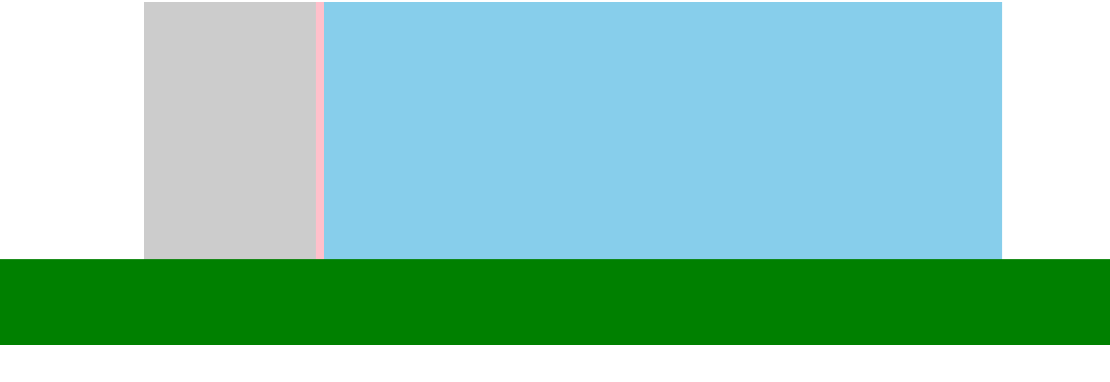
由于父级盒子很多情况下不方便给高度,但是子盒子浮动又不占有位置,最后父级盒子高度为 0 时,就会影响下面的标准流盒子。如下图所示,当父级盒子有高度时
1
2
3
4
5
6
7
8
9
10
11
12
13
14
15
16
17
18
19
20
21
22
23
24
25
26
27
28
29
30
31
32
33
34
35
36
37
38
39
40
41
42
43
44
| <!DOCTYPE html>
<html lang="en">
<head>
<meta charset="UTF-8">
<meta http-equiv="X-UA-Compatible" content="IE=edge">
<meta name="viewport" content="width=device-width, initial-scale=1.0">
<title>Document</title>
<style>
.top {
margin: 0 auto;
width: 1000px;
height: 300px;
background-color: pink;
}
.bottom {
height: 100px;
background-color: green;
}
.left {
float: left;
width: 200px;
height: 300px;
background-color: #ccc;
}
.right {
float: right;
width: 790px;
height: 300px;
background-color: skyblue;
}
</style>
</head>
<body>
<div class="top">
<div class="left"></div>
<div class="right"></div>
</div>
<div class="bottom"></div>
</body>
</html>
|
当父级盒子没有有高度时
1
2
3
4
5
6
7
8
9
10
11
12
13
14
15
16
17
18
19
20
21
22
23
24
25
26
27
28
29
30
31
32
33
34
35
36
37
38
39
40
41
42
43
44
| <!DOCTYPE html>
<html lang="en">
<head>
<meta charset="UTF-8">
<meta http-equiv="X-UA-Compatible" content="IE=edge">
<meta name="viewport" content="width=device-width, initial-scale=1.0">
<title>Document</title>
<style>
.top {
margin: 0 auto;
width: 1000px;
background-color: pink;
}
.bottom {
height: 100px;
background-color: green;
}
.left {
float: left;
width: 200px;
height: 300px;
background-color: #ccc;
}
.right {
float: right;
width: 790px;
height: 300px;
background-color: skyblue;
}
</style>
</head>
<body>
<div class="top">
<div class="left"></div>
<div class="right"></div>
</div>
<div class="bottom"></div>
</body>
</html>
|
小结
- 清除浮动的含义是什么?
- 清除浮动带来的影响
- 影响:如果子元素浮动了,此时子元素不能撑开父元素
- 清除浮动的目的是什么?
- 需要父元素有高度,从而不影响其他网页元素的布局
5.3 如何清除浮动
5.3.1 直接设置父元素高度
- 特点:
- 优点:简单粗暴,方便
- 缺点:有些布局中不能固定父元素高度。如:新闻列表、京东推荐模块
5.3.2 额外标签法
额外标签法也称为隔墙法,是 W3C 推荐的做法。
额外标签法会在浮动元素末尾添加一个空的标签。例如 <div style="clear: both"></div>,或者其他标签(如 <br> 等)。
- 优点: 通俗易懂,书写方便
- 缺点: 添加许多无意义的标签,结构化较差
注意: 要求这个新的空标签必须是块级元素。
1
2
3
4
5
6
7
8
9
10
11
12
13
14
15
16
17
18
19
20
21
22
23
24
25
26
27
28
29
30
31
32
33
34
35
36
37
38
39
40
41
42
43
44
45
46
47
48
49
50
| <!DOCTYPE html>
<html lang="en">
<head>
<meta charset="UTF-8">
<meta http-equiv="X-UA-Compatible" content="IE=edge">
<meta name="viewport" content="width=device-width, initial-scale=1.0">
<title>Document</title>
<style>
.top {
margin: 0 auto;
width: 1000px;
background-color: pink;
}
.bottom {
height: 100px;
background-color: green;
}
.left {
float: left;
width: 200px;
height: 300px;
background-color: #ccc;
}
.right {
float: right;
width: 790px;
height: 300px;
background-color: skyblue;
}
.clearfix {
clear: both;
}
</style>
</head>
<body>
<div class="top">
<div class="left"></div>
<div class="right"></div>
<div class="clearfix"></div>
</div>
<div class="bottom"></div>
</body>
</html>
|
5.3.3 单伪元素清除法
操作:用伪元素替代了额外标签
基本写法:
1
2
3
4
5
6
| .clearfix::after {
content: '';
/* 伪元素添加的标签是行内, 要求块 */
display: block;
clear: both;
}
|
补充写法
1
2
3
4
5
6
7
8
9
| .clearfix::after {
content: '';
/* 伪元素添加的标签是行内, 要求块 */
display: block;
clear: both;
/* 为了兼容性 */
height: 0;
visibility: hidden;
}
|
案例:
1
2
3
4
5
6
7
8
9
10
11
12
13
14
15
16
17
18
19
20
21
22
23
24
25
26
27
28
29
30
31
32
33
34
35
36
37
38
39
40
41
42
43
44
45
46
47
48
49
50
51
52
53
54
55
56
57
58
| <!DOCTYPE html>
<html lang="en">
<head>
<meta charset="UTF-8">
<meta http-equiv="X-UA-Compatible" content="IE=edge">
<meta name="viewport" content="width=device-width, initial-scale=1.0">
<title>Document</title>
<style>
.top {
margin: 0 auto;
width: 1000px;
background-color: pink;
}
.bottom {
height: 100px;
background-color: green;
}
.left {
float: left;
width: 200px;
height: 300px;
background-color: #ccc;
}
.right {
float: right;
width: 790px;
height: 300px;
background-color: skyblue;
}
.clearfix::after {
content: '';
display: block;
clear: both;
height: 0;
visibility: hidden;
}
</style>
</head>
<body>
<div class="top clearfix">
<div class="left"></div>
<div class="right"></div>
</div>
<div class="bottom"></div>
</body>
</html>
|
5.3.4 双伪元素清除法
额外标签法的升级版,也是给给父元素添加代码。
原理:自动在父盒子里的两端添加两个行内盒子,并把它们转换为 表格,间接实现了额外标签法。
1
2
3
4
5
6
7
8
9
10
11
12
13
| /* 清除浮动 */
.clearfix::before,
.clearfix::after {
content: '';
display: table;
}
/* 真正清除浮动的标签 */
.clearfix::after {
/* content: '';
display: table; */
clear: both;
}
|
案例:
1
2
3
4
5
6
7
8
9
10
11
12
13
14
15
16
17
18
19
20
21
22
23
24
25
26
27
28
29
30
31
32
33
34
35
36
37
38
39
40
41
42
43
44
45
46
47
48
49
50
51
52
53
54
55
56
57
58
59
60
61
| <!DOCTYPE html>
<html lang="en">
<head>
<meta charset="UTF-8">
<meta http-equiv="X-UA-Compatible" content="IE=edge">
<meta name="viewport" content="width=device-width, initial-scale=1.0">
<title>Document</title>
<style>
.top {
margin: 0 auto;
width: 1000px;
background-color: pink;
}
.bottom {
height: 100px;
background-color: green;
}
.left {
float: left;
width: 200px;
height: 300px;
background-color: #ccc;
}
.right {
float: right;
width: 790px;
height: 300px;
background-color: skyblue;
}
.clearfix::before,
.clearfix::after {
content: '';
display: table;
}
.clearfix::after {
clear: both;
}
</style>
</head>
<body>
<div class="top clearfix">
<div class="left"></div>
<div class="right"></div>
</div>
<div class="bottom"></div>
</body>
</html>
|
5.3.5 给父元素设置overflow : hidden
- 操作:
- 直接给父元素设置 overflow : hidden
- 特点:
1
2
3
4
5
6
7
8
9
10
11
12
13
14
15
16
17
18
19
20
21
22
23
24
25
26
27
28
29
30
31
32
33
34
35
36
37
38
39
40
41
42
43
44
45
46
| <!DOCTYPE html>
<html lang="en">
<head>
<meta charset="UTF-8">
<meta http-equiv="X-UA-Compatible" content="IE=edge">
<meta name="viewport" content="width=device-width, initial-scale=1.0">
<title>Document</title>
<style>
.top {
margin: 0 auto;
width: 1000px;
background-color: pink;
overflow: hidden;
}
.bottom {
height: 100px;
background-color: green;
}
.left {
float: left;
width: 200px;
height: 300px;
background-color: #ccc;
}
.right {
float: right;
width: 790px;
height: 300px;
background-color: skyblue;
}
</style>
</head>
<body>
<div class="top">
<div class="left"></div>
<div class="right"></div>
</div>
<div class="bottom"></div>
</body>
</html>
|